User and Brand Experience Design User and Brand Experience Design
← Back to projects overview
UX Design Skill Swap hero
An inclusive social application that encourages collaboration and enables people to exchange skills and services, when and where it suits them. To find suitable help SKILLDEALS focuses on the individuals own strenghts rather than on how much money they got. Everyone can do what they do best and most importantly: enjoy! Role Research UX Design UI Design Timeline August – December 2020 Methods Design Thinking with Accessibility First Approach, Evidence based human-centered Design, Mobile First Tools Adobe XD Optimal Workshop Usability Hub Pen & Paper
The Problem People that don‘t have much money to spend on required services need a way to use the ressources they always have; their own skills and experience to trade them for what is needed. The Solution An application that allows users to promote their skills and trade them for services they might not be so skilled in.
The process- design thinking: As a cornerstone of the iterative project processes I used design thinking. This allowed for several refinements based on: - Understanding the user's needs - Challenging my own assumptions - Integrate valuable feedback
SWOT Analysis
Business Requirements: To further understand the challenge and to align all stakeholders on the requirements of the application, I created a Business Requirements Document (BRD). Main Outcomes: - Application only works with large and active user base. - For high sign-up rate focus should be on human centered design and comprehensive marketing campaign. - Monetizing through premium account users.
Possible Users: To understand my possible users I conducted an online user survey with closed ended questions and comment opportunity. This brought valuable insights, that I then further evaluated through in-person interviews. Goals - Find out who possible users for my application would be. - Find out about their motivations and concerns. - Find out what features they'd wish for.# - Provide stakeholders with confidence that the concept will be effective. Evaluation: With an Affinity Map I sorted the survey and interview findings into categories. This allowed me to: - Look at the insights with fresh eyes. - Draw new connections. - Think about required features. Main Findings - Most participants think such app would help them safe money, make their life's easier and connect them to new people/exeriences. - The idea speaks to people from a variety of professional backgrounds in the age group of 26 - 55. - Some participants are concerned about online data. - Most participants trade within their neighbourhood and are interested in expanding outside of their circle. - Most of the participants are concerned with trusting strangers and the quality of the service. - All participants trust strangers more, if they can find out about the person's personality/motivations.
User Persona To make sure the end-users will always be considered by the product team, I created different personas with individual needs and behaviours based on the result of the user research. Since I aim for an inclusive product for everyone, I decided to mostly focus on my main persona with special accessibility needs.
USER JOURNEY MAP & FLOWS To understand Andreas journey through the app to reach her destination withouth friction and define further requirements, I designed this User Jorney Map and Task Flow.
Information Architecture Andrea's and the other personas User Journeys got me a clearer idea about what features of the app are required. I conducted an Open Card Sort to group and categorize SKILL DEALS components. - Group and categorize SKILL DEALS components. - Develop a navigation and menu structure that is logical and usable. Using these insights I built the Sitemap of the application. The sitemap has been further refined after usability testing. Below you can see it's most recent state.
Sitemap
Wireframes As a next step I started with low-fidelity wireframe sketches to see if the overall navigation works. I gradually improved the fidelity of the wireframes until I could create a clickable prototye that I then used for Usability Tests.
Usability Testing I tested four relevant features of the app through remote and in-person moderated usability tests with six different participants from different background and age groups. I closely observed my participants thoughts and impressions as well as the activity on the screen-share.
Test Findings: Using Jacob Nielsen's Error Scale to rate the severity of the problems I observed during the test I made decisions about which errors to tend to. I analyzed both: - Quantitative data: Number of users encountering the same error? - Qualitative data: How much affected those errors the success of the task?
Jacob Nielsens Error Scale Test Findings
Iterations: These are three main iterations on the prototype after the Usability Tests. I used this opportunity to also increase the fidelity of my screens. Example – Skill Deals Control: The Issue: - Participants supposed they have to press the buttons before they can chat. - Deal happens within the chat window so the areas My Deals + Messages should be combined. The Solution: - Merge My Deals + Messages - Further work on deal control options/buttons
Example – Onboarding Notifications The Issue: - No participant paid attention to the notifications (there were further onboarding instructions in there.) The solution: - Scrape notifications in mobile version. - Onboarding markers whenever neccessary.
Example – Verified Skill with hourly rate: The Issue: - 3/6 participants were confused about paying money option. - Option must be clear since app monetizes through premium accounts who can request money as a skill deal alternative. The Solution: - More teaching about validated skills in profile set-up. - Add the little word "or" to show the two buttons as alternatives.
Using preference testing and the WCAG 2.0 Guidelines I examined Skill Deals accessibility for a final check to make sure it caters to all people. Preference Test Visual Design of input fields
Consulting Web Content Accessibility Guidelines (WCAG) 2.0
High Fidelity Screens 1
High Fidelity Screens
High Fidelity Screens 3
High Fidelity Screens 4

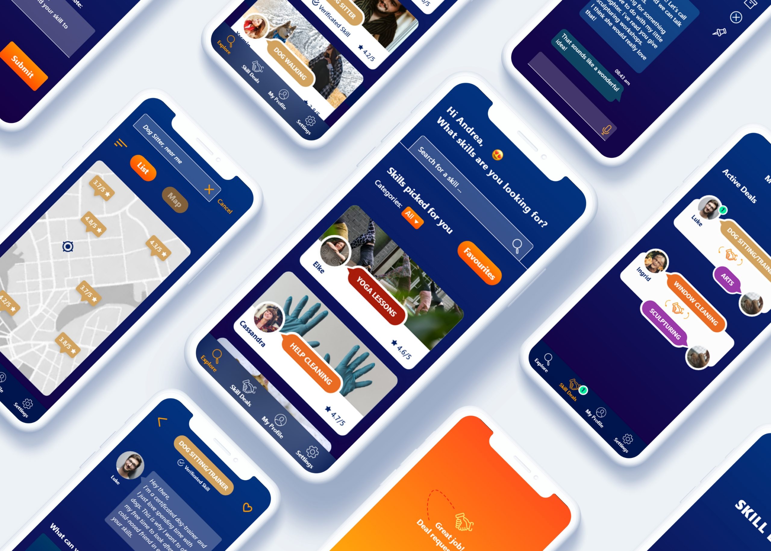
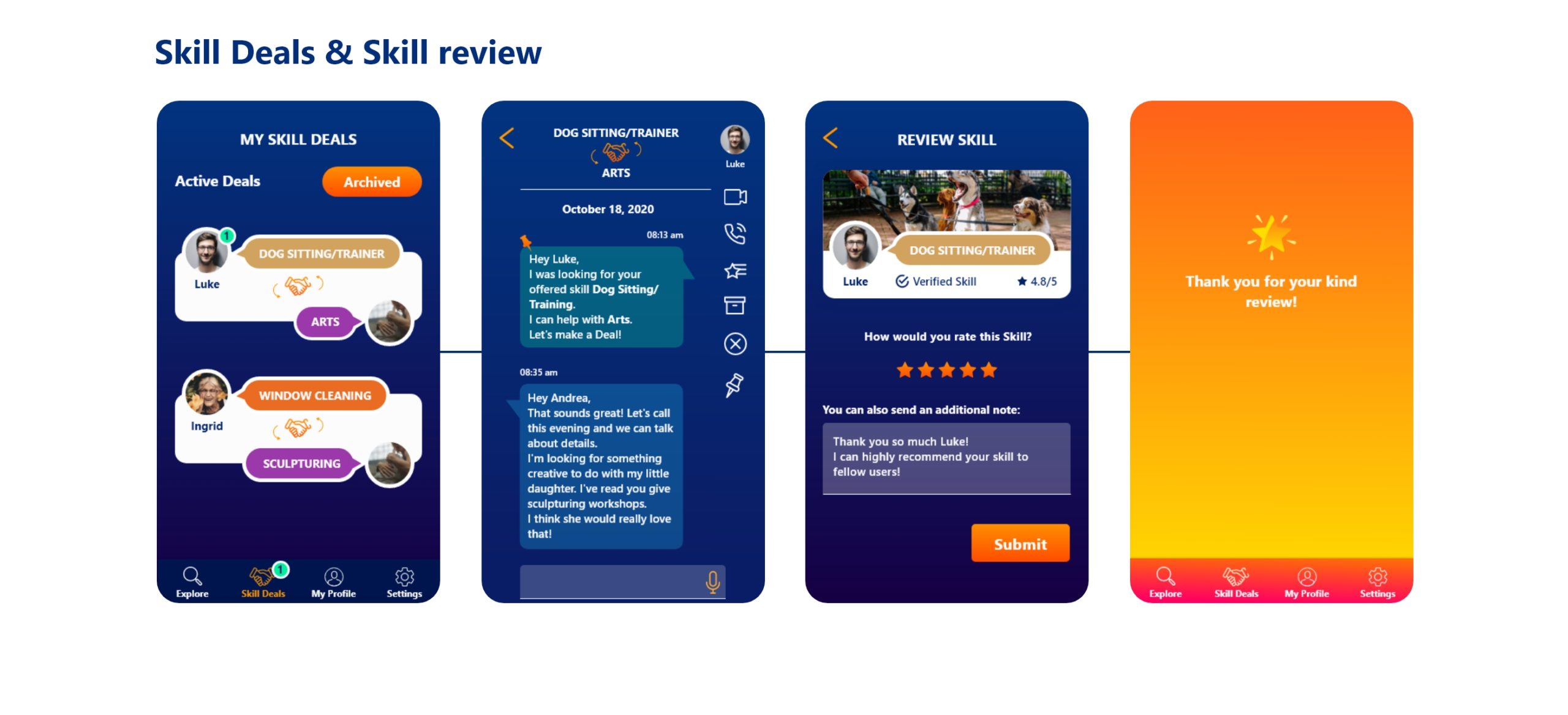
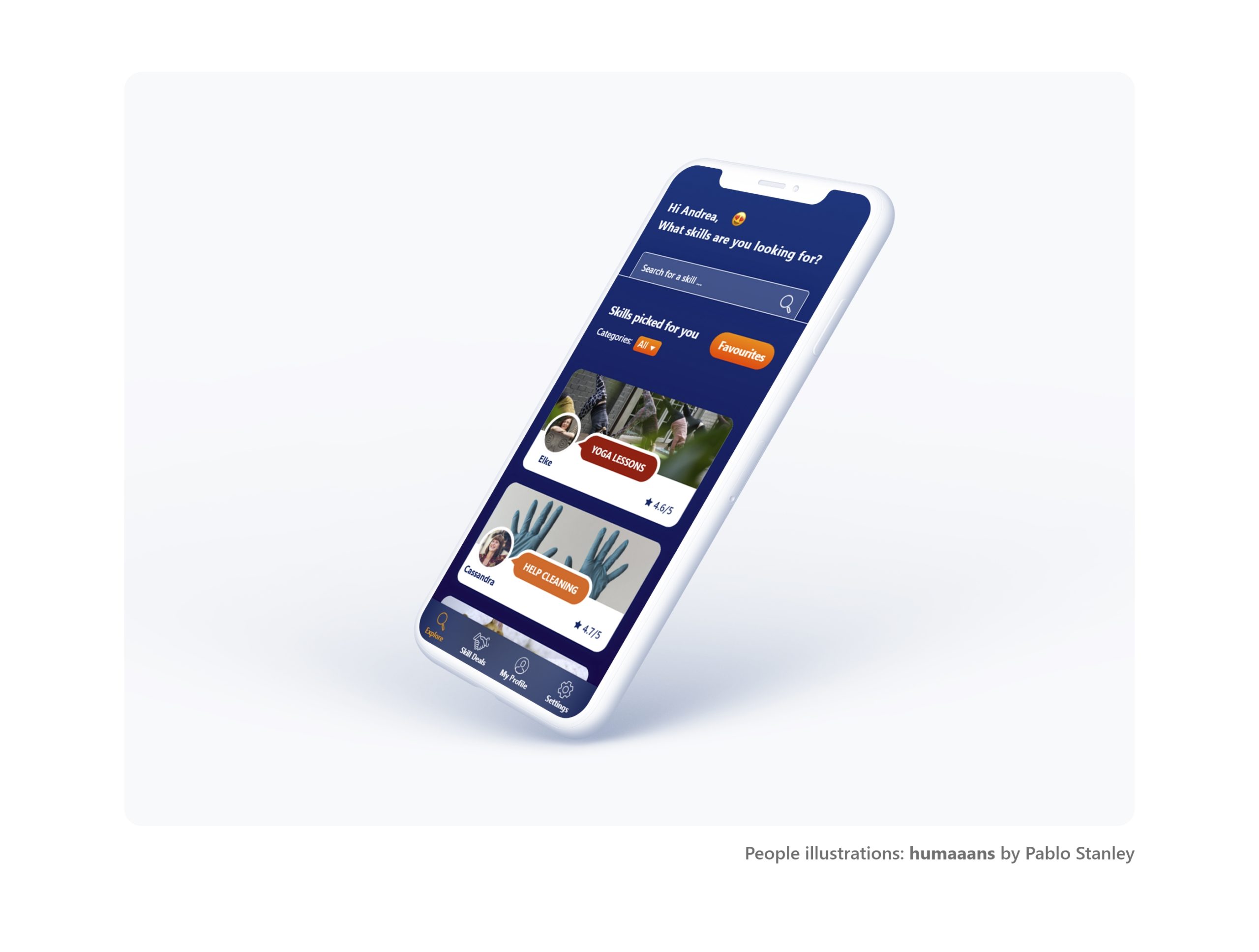
Click here to try out the clickable prototype.
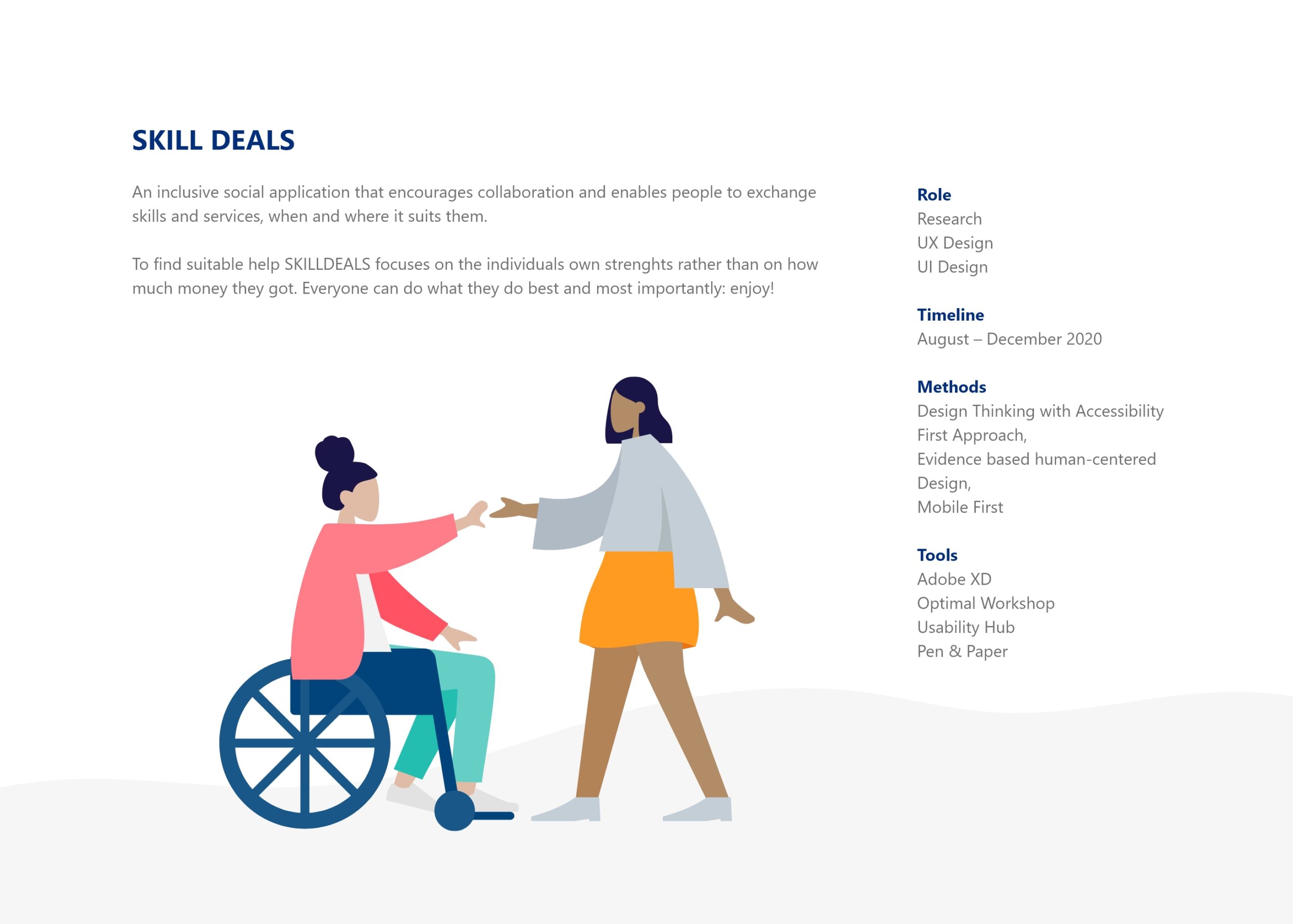
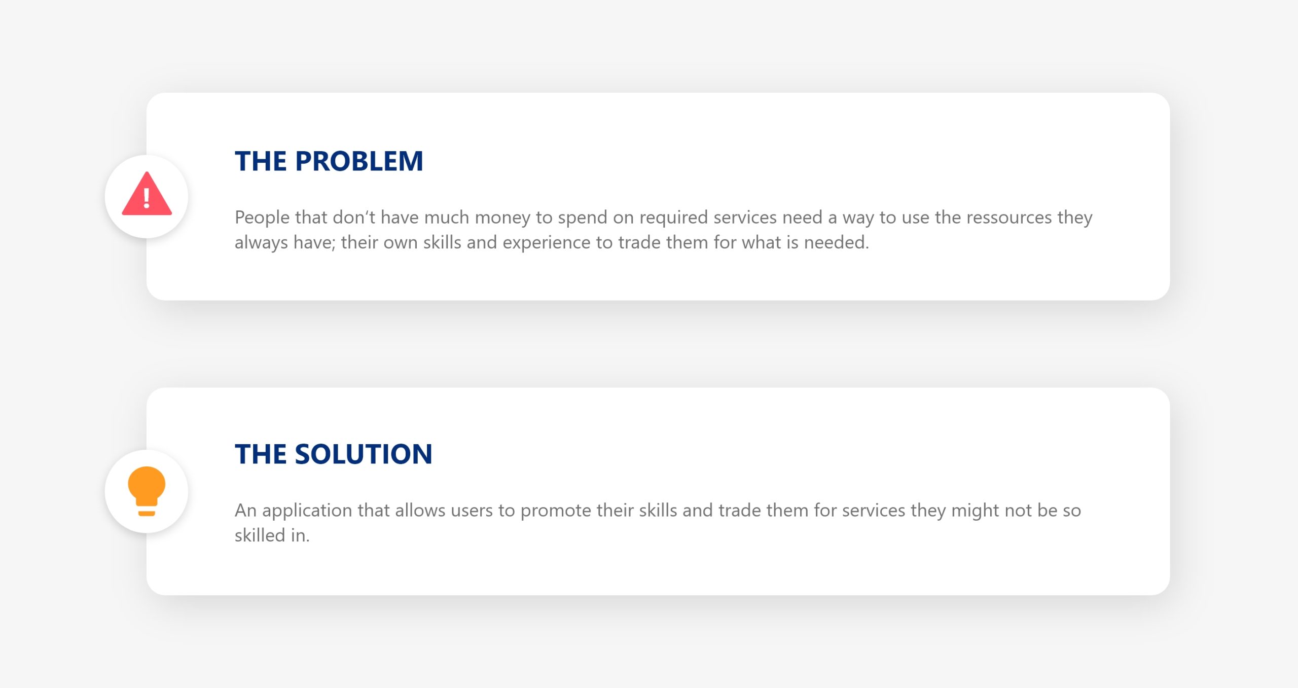
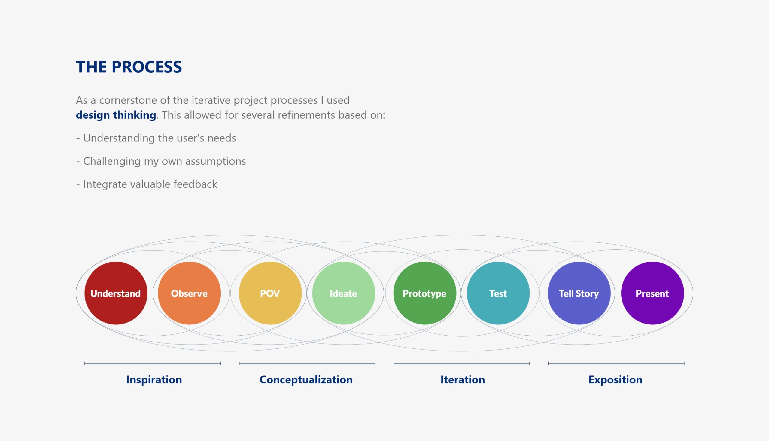
Click here for the Clickable Prototype
Thank you for your time. please contact me for work opportunities
© Vicky Peucker | 2021
Privacy Policy

Say Hello:
E-Mail, Bēhance & LinkedIn

  • What I Did
  • Who I am
  • Say Hello

Our site uses cookies. Learn more about our use of cookies: cookie policy

ACCEPT